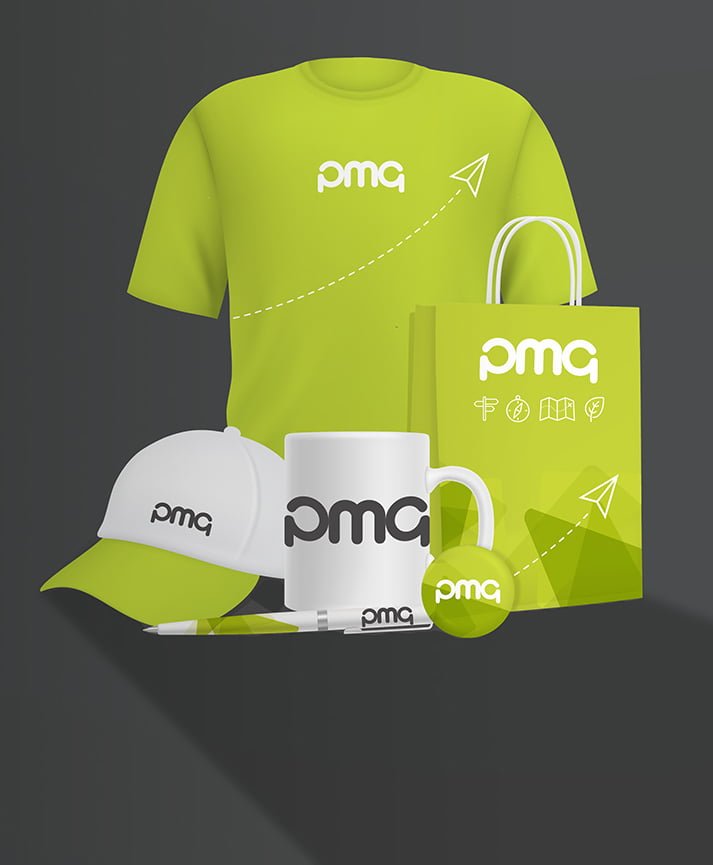
Creating a unique and distinctive logo for your brand is key to helping you raise brand awareness and even become a household name. Without a recognisable logo, your campaigns might be misunderstood or your products anonymous – logos are a clear way of communicating what your business is all about. A good logo will often evoke emotions from within the customer, either dividing or inspiring people, depending on what they associate it with. Here at PMG Print Management, our design studio team use their experience and know-how to create innovative and attractive logos for print, and can ensure your design reflects your company image perfectly. Take a look at these five recognisable logos and what has made them so effective…
McDonald’s
The key to creating a successful logo is that is must be memorable, and the more complicated a logo is, the less memorable it will be. The famous McDonald’s ‘M’ logo is recognisable around the world and cannot be mistaken for anything else, due to its simplicity and the distinctive shape of the so-called ‘golden arches.’ Despite the fact that the McDonald’s colour scheme is known throughout the world the company’s logo has become so recognisable that it is still effective without colour, though a lot of thought went into choosing the famous red and yellow design. Red and yellow are known to evoke excitement and trigger hunger, so it’s no wonder we’re always salivating at the sight of the golden arches! McDonald’s logo is a very effective piece of print design and marketing.
Coca-Cola
In order for a logo to remain effective for as long as the company is in business, it has to be timeless. Changing the logo too much can take away from its effectiveness – the best logos have changed very little over the years so those who have grown up with them still equate them with brand loyalty today. The cursive script was a popular handwriting style of the time the Coca-Cola logo was created, exemplifying just how simple the logo was and has remained, and the colours of red and white were used to represent the ‘youthful exuberance of America.’ While Coca-Cola is often now shortened to just ‘Coke,’ the logo has not changed in many decades.
Apple
Having found new success primarily over the past decade you’d think the Apple brand was relatively new, it if were not for the distinctive logo that has been recognisable for far longer than the brand’s recent renaissance. The Apple logo has been seen on computers for almost twenty years and is extremely distinctive, due to the single bite that has been taken out of the otherwise flawless apple silhouette. There are a number of logos that are very similar to one another, which is why Apple thought to add the missing chunk to ensure that no one would mistake their apple for anything else.
Nike
The famous Nike tick is recognised all over the world as the brand’s clothing is worn by millions – and not just those with an interest in sport. Distinctive and memorable, the logo is so simple that it could not possibly be mistaken for anything else or replicated by a competitor. The logo is actually meant to represent the wing of a Greek Goddess: Nike, the Goddess of Victory. Although not particularly common knowledge, the majority of great logos are created from a great story such as this one.
Starbucks
The Starbucks logo is recognised around the world and is often the first thing people think of when they crave a coffee. It’s distinctive green and white colour scheme is eye-catching enough, but the siren that sits in the middle of the image makes Starbucks’ logo stand out from its competitors – but why the siren? The creators of Starbucks chose the siren to symbolise the great draw of quality coffee, much like the sirens tempted Odysseus in Greek mythology, and the colours were chosen as a nod to one of the creators’ school colours. Only recently was the logo changed, the company removing the outer circle and the brand name ‘Starbucks Coffee.’ This change was implemented for two reasons: Starbucks now serve more than coffee alone, and the company realised that their logo had become so recognisable that it no longer needed a visual link to the brand’s name.
If you’re looking to create a logo just as impressive as the five above that will stand the test of time and help to bring your future print campaigns to life, the team at PMG can help. Why not get in touch with the team today and we can start discussing your ideas?


